Context
ZS was undergoing a brand update. New colors, typography, and marketing materials were to be consumed by all product teams.
To go with this rebrand, our in-house ZS UI team had created new components, icons, typography, and colors for software development.
However, the ZS UI team’s work was focused on desktop experiences and codebases, so therefore not entirely applicable to our product.
The understanding at the time was that VERSO would only update colors, and typography while retaining its existing UI.
While all this was going on, the UX team was also in the midst of switching from Axure to Figma as our primary design tool.
Recap:
A firm-wide brand update.
As part of the update, desktop products were getting new components, new icons, typography, color. Since no mobile specific UI work was done, our product was to only update colors and typography.
UX team was switching design tools (Axure to Figma)
The idea of only switching colors and fonts seemed like a missed opportunity. I felt our components and UI were long overdue for a refresh, and we also had a few backlog ideas for layout improvements that I thought we could roll into this activity. I saw this as an opportunity to accomplish multiple goals at the same time.
The Opportunity:
Build a VERSO design system in Figma using new, revamped mobile components based off the newly updated ZS desktop components.
Replace the older production VERSO components with the updated components, so our product maintains a consistent look and feel with other ZS products.
Pull through some backlog UI/UX improvement items that needed some traction.
Goals:
A comprehensive Figma design system that can be readily consumed by designers and developers.
An improved UI that is consistent with other rebranded ZS products and meets user expectations of a modern mobile application.
Planning
I addressed the following before proceeding with actual design system work
Buy-in from VERSO product management and technical team leadership for an updated UI.
Leadership also felt the UI had become dated, so it was a relatively short conversation to align on setting aside technical team bandwidth for this activity.Collaborate with the ZS UI Design team to see if any of their work on desktop was applicable to our mobile platform.
Which desktop components and styles could be adapted to mobile? Were there any mobile specific components and styles that needed custom refinement?
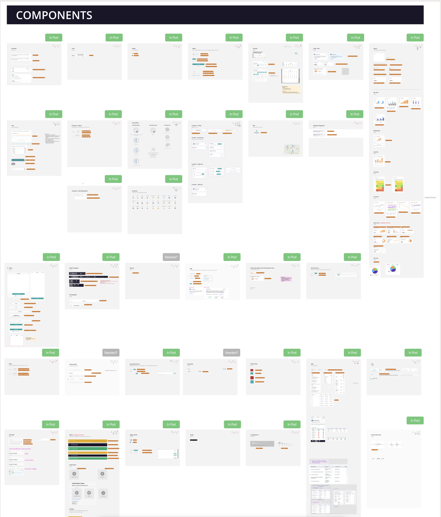
Since our existing Axure component library was incomplete, we started design work by grabbing screenshots from our VERSO demo environment and front-end development component repository, referred to as the “Pod”. Here we could see all the components used in the app, and translate/update them one by one into Figma.
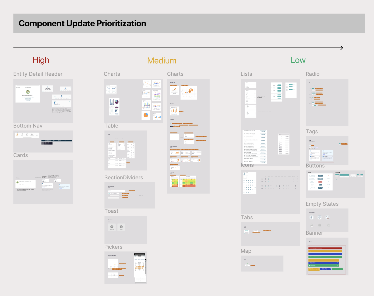
From there we prioritized the components based on how easily they could be updated (High = No desktop or iOS native equivalent).
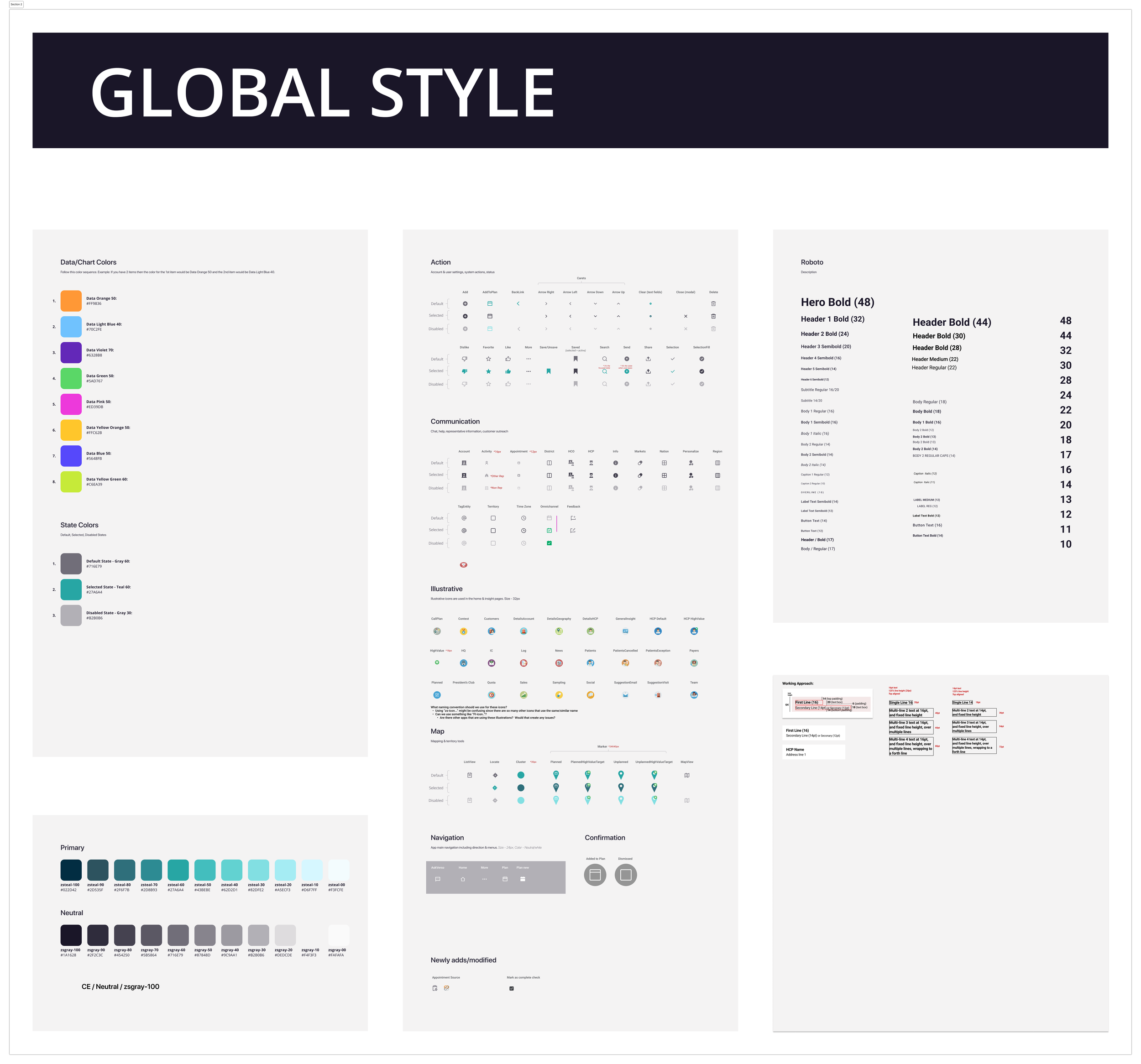
We also used this time to re-evaluate our iconography. I conducted an icon study with our junior designers for a better understanding of icon principles, when to use icons, and what style of icon to use.
Execution
Thankfully we were able to adapt the new desktop styles to a majority of our components. In cases where a mobile component did not have a 1:1 desktop counterpart and required redesign, we collaborated with the ZS UI designers to ensure that the ZS look and feel came through while accommodating mobile behavior.
Icons and colors were simple additions that were taken directly from the desktop.
What required additional thought was how to structure the Figma component library itself, and learning how to use component and variant features.
I came up with a naming structure/taxonomy that would allow us to categorize components and their different “states”, enabling the variant and component feature in Figma, and building up to the goal of streamlining our design processes.
With the component designs sorted out, a naming structure in place, we could proceed with assembling the design system in Figma.
Output
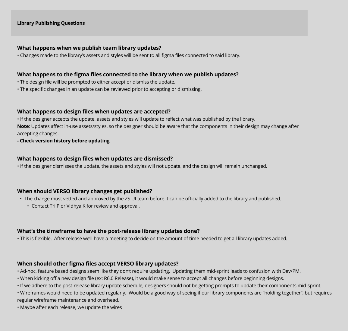
After 2 weeks of planning, and another 2 weeks of assembly, our the VERSO Figma Design System was ready for consumption. The final addition was a FAQ page I put together, detailing how to maintain the design system file.
Shortly after, we were able to update all of our app wireframes with the new components. Along the way, we pulled through some backlog UI updates that would improve the UX. These changes were based on client feedback, and our own understanding of modern mobile design.
Improvements:
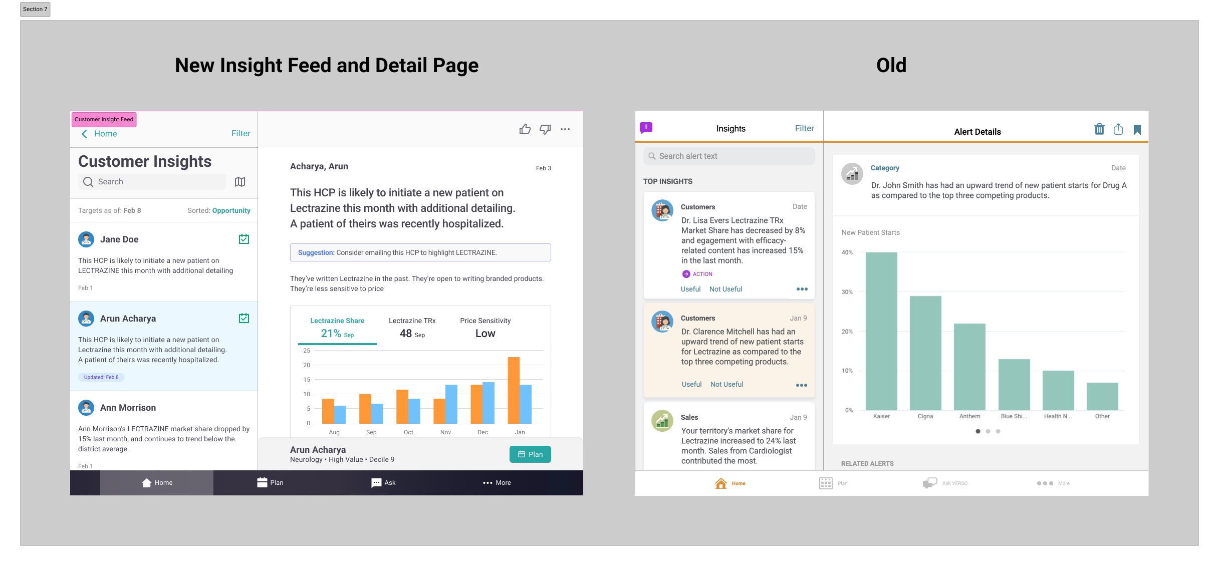
Insight Detail Page Redesign:
Suggestions are now displayed inline with Insights, allowing reps to cross reference suggestions with insight data without having to jump between screens.
Data visualizations now use tabbed navigation, allowing for easier discovery versus carousels.
Planning action and Customer Profile contained in a persistent footer, making these high frequency actions are now more easily accessible.
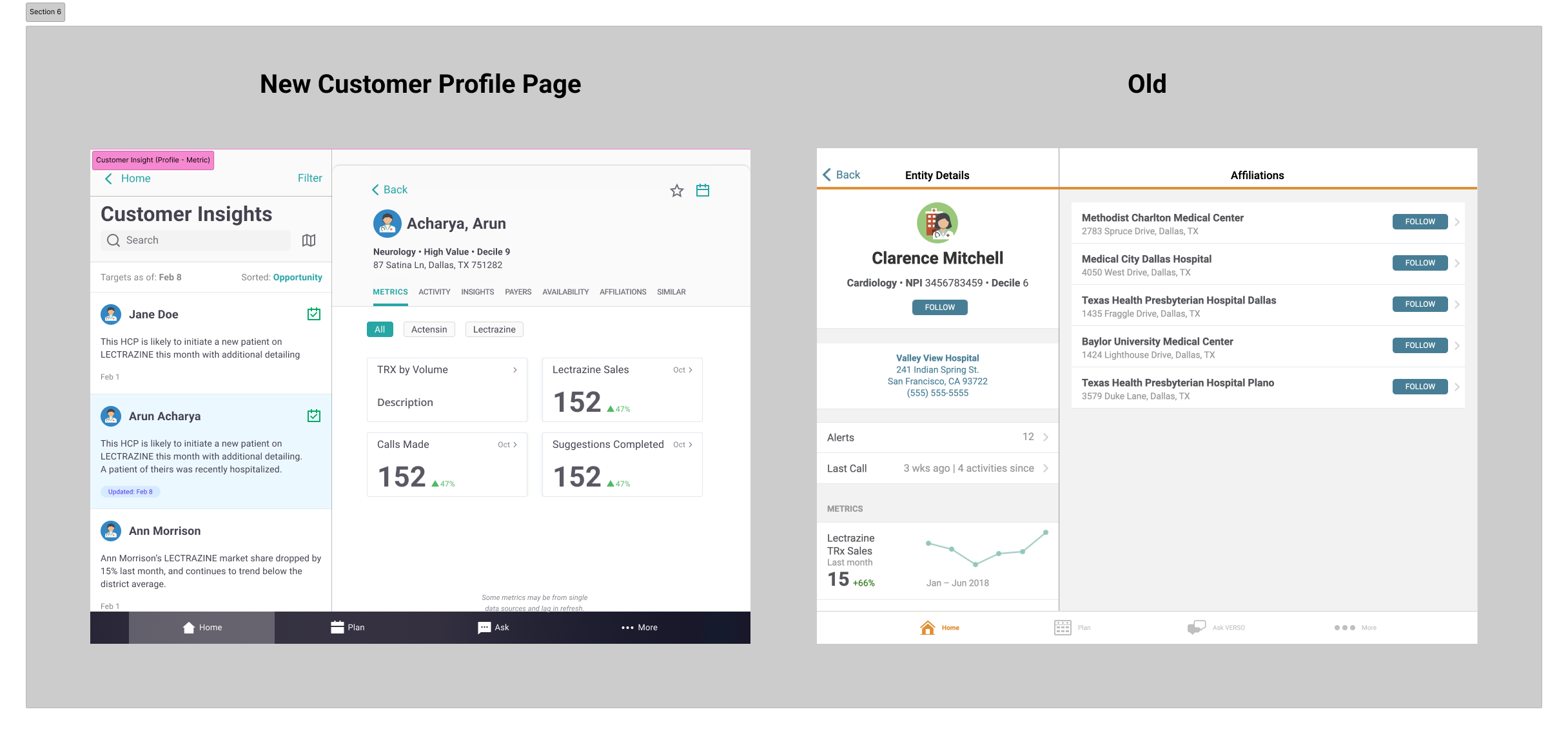
Customer Profile Page Redesign:
Profile pages now display in a pull up sheet (from the above mentioned footer), allowing reps to maintain context with their insights and suggestions.
Profile pages now use tabbed navigation for easier access to Customer sub-pages.
Result
Fully operational Figma design system/component library usable by designers and developers, with FAQ page. As the first mobile design system at ZS, our work would have firm-wide impact, eventually leveraged by 2 other ZS mobile apps
Updated VERSO UI with redesigned components, providing a look and feel consistent with other ZS products and meeting expectations of a modern mobile application.
