How I got pharma sales reps to trust our AI/ML suggestion platform
Core Team
1 Senior UX Designer (Me)
1 Lead Developer
1 Junior Front-End Developer
1 Product Manager
Leadership/Stakeholders:
UX Manager
Director of Customer Engagement
Client Contact
My Contributions
Led discovery workshops
Pain Point/Goal Analysis
Persona Crafting
User Stories
Design Strategy
High Fidelity Design
Tools
Figma
ZAIDYN Design System
PowerPoint
Confluence
JIRA
Outcomes
Feature was delivered and implemented on time for release
Positive end-user feedback
9 out of 10 users felt more prepared with Suggestions.
8 out of 10 users indicated it would help them act on more suggestions.
8 out of 10 users thought it would help them improve their sales.
Context
Field Insights is an ML powered insight and suggestion platform built to help sales reps plan their sales engagements with doctors.

Insights are an alert or observation regarding the customer’s prescribing habits or activity.
Suggestions will recommend how to engage with the customer, based on the Insight.
Field Insights also offers other features like call planning and appointment scheduling, but this story focuses on Suggestions
Research & Workshopping
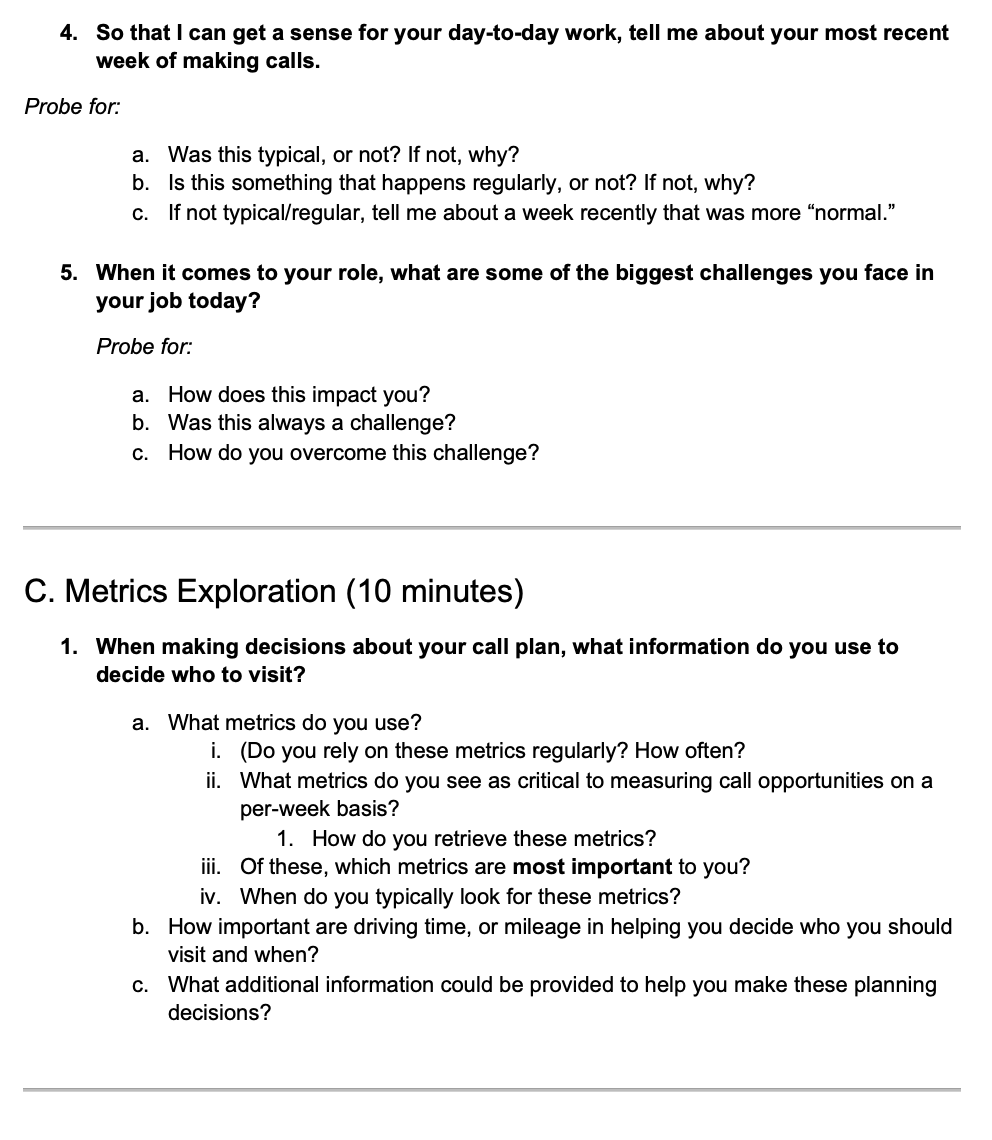
We conducted a moderated usability-test of our app with end-users.
I collaborated with our UX researchers to create a test plan and script.
Specifically, I provided guidance on which workflows to test, and exploratory questions to ask during the test.
I facilitated brainstorming and discovery activities to formulate ideas for revamping our suggestion outputs.
I brought these ideas to our PMs and they were able to determine if the ideas were feasible from a data procurement perspective.
On the development side, I reached out to our lead developer to determine if the new data could be integrated into our algorithms.
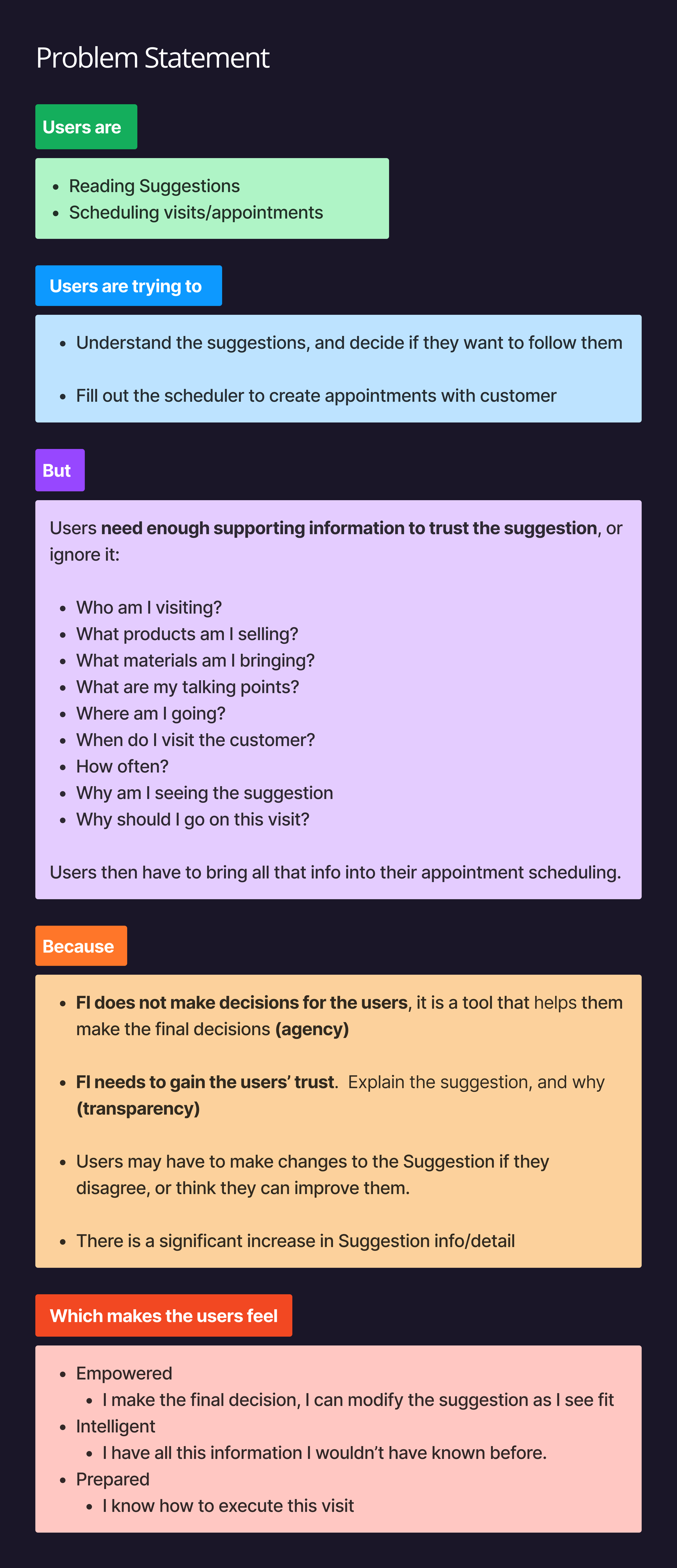

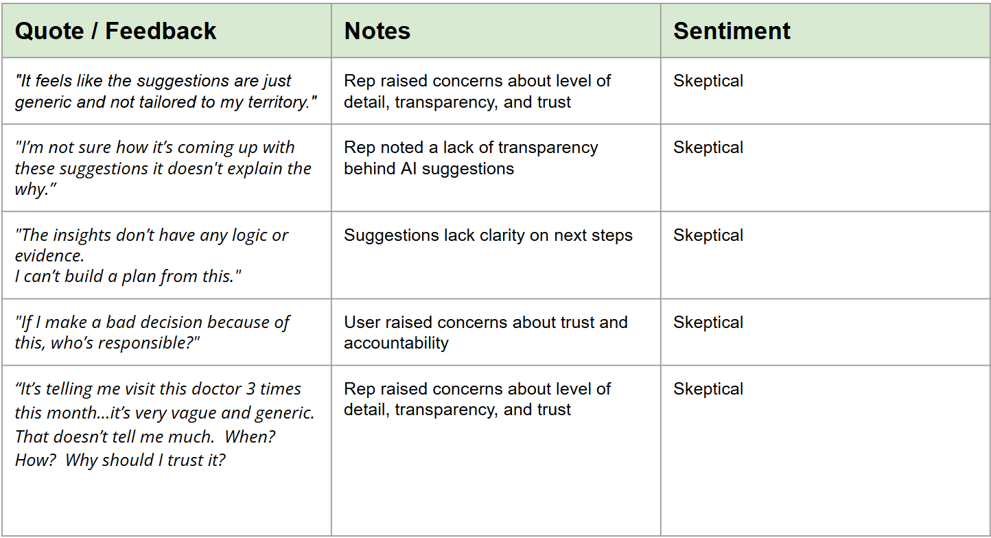
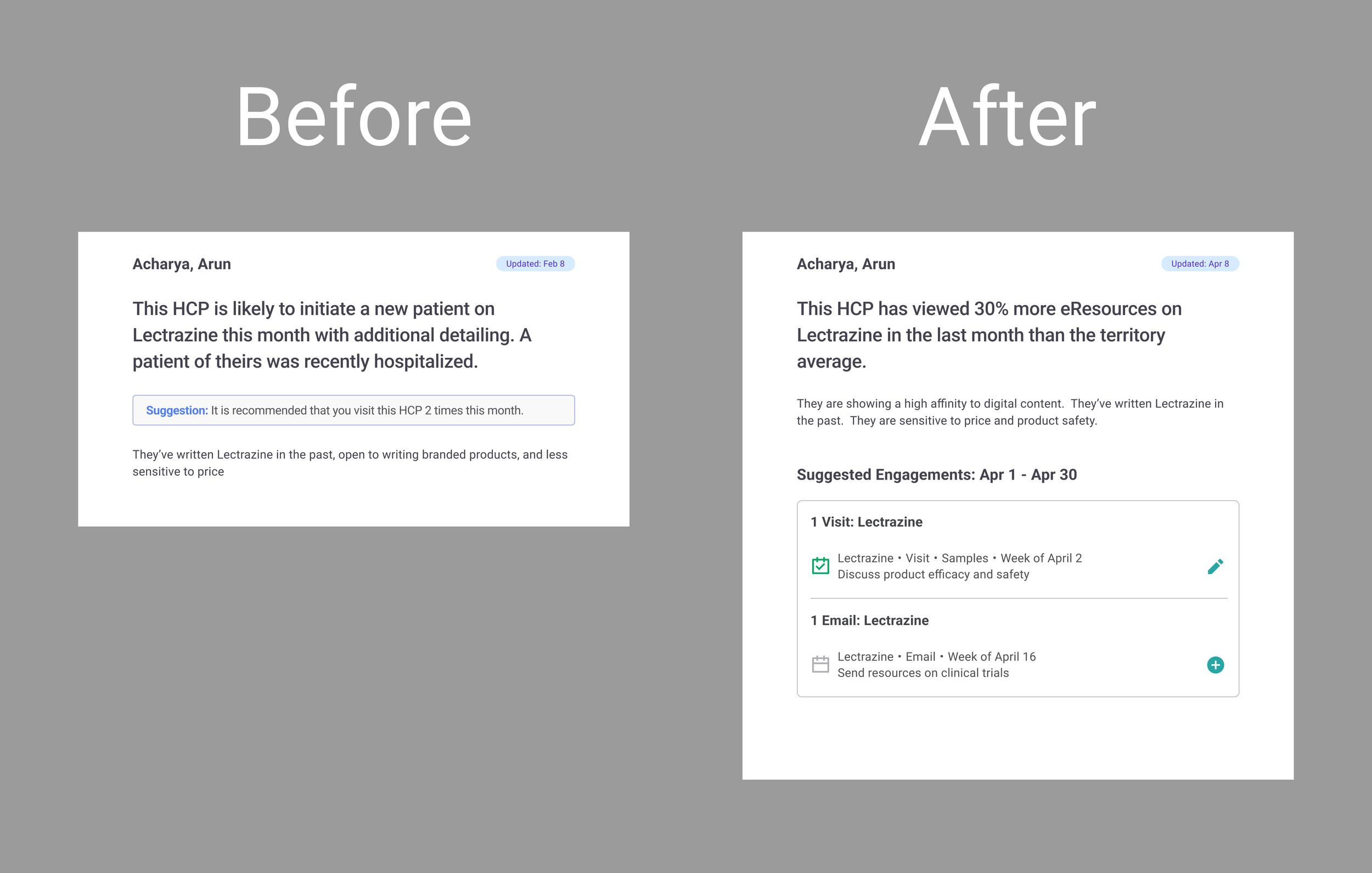
Feedback from the tests indicated a gap in trust and understanding of the suggestion engine outputs.
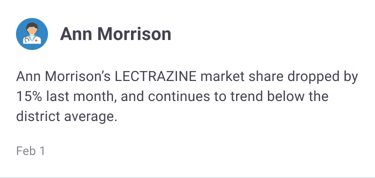
The app wasn’t able to make Suggestions with specificity beyond something like “Visit this doctor 2 times this month”.
It could identify customers in need of engagement, but wasn’t able to recommend how to engage them in any detail.
Users were unsure if they could trust the suggestions, and if they did, weren’t sure how to execute them.

Solution
Working backwards from the customer relationship management platforms and our new understanding of sales rep behavior, we came up with the following improvements to the suggestion outputs:
Call Type:
Whether it’s the standard 5-15 minute face-to-face visit, email, virtual meeting, or something specific like a breakfast, the app can now suggest specific types of engagements according the doctor’s previous activity.
Supplementary Materials:
Suggestions can now recommend reps bring materials such as samples, copay cards, and marketing materials on their visits based on the doctor’s follow-up needs.Date Ranges:
Suggestions will now recommend a range such as “Week of March 3rd” based on a variety of factors such as competitor activity, prescription data, and call frequency models.Interaction Messaging:
Suggestions will now recommend topics for users to discuss with customers, such as specific products or clinical trial results based the doctor’s interactions with marketing materials and industry activity

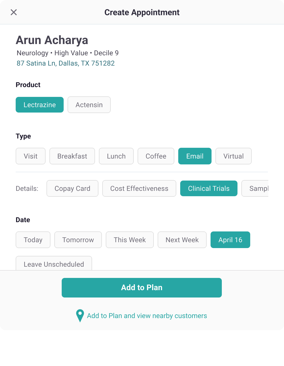
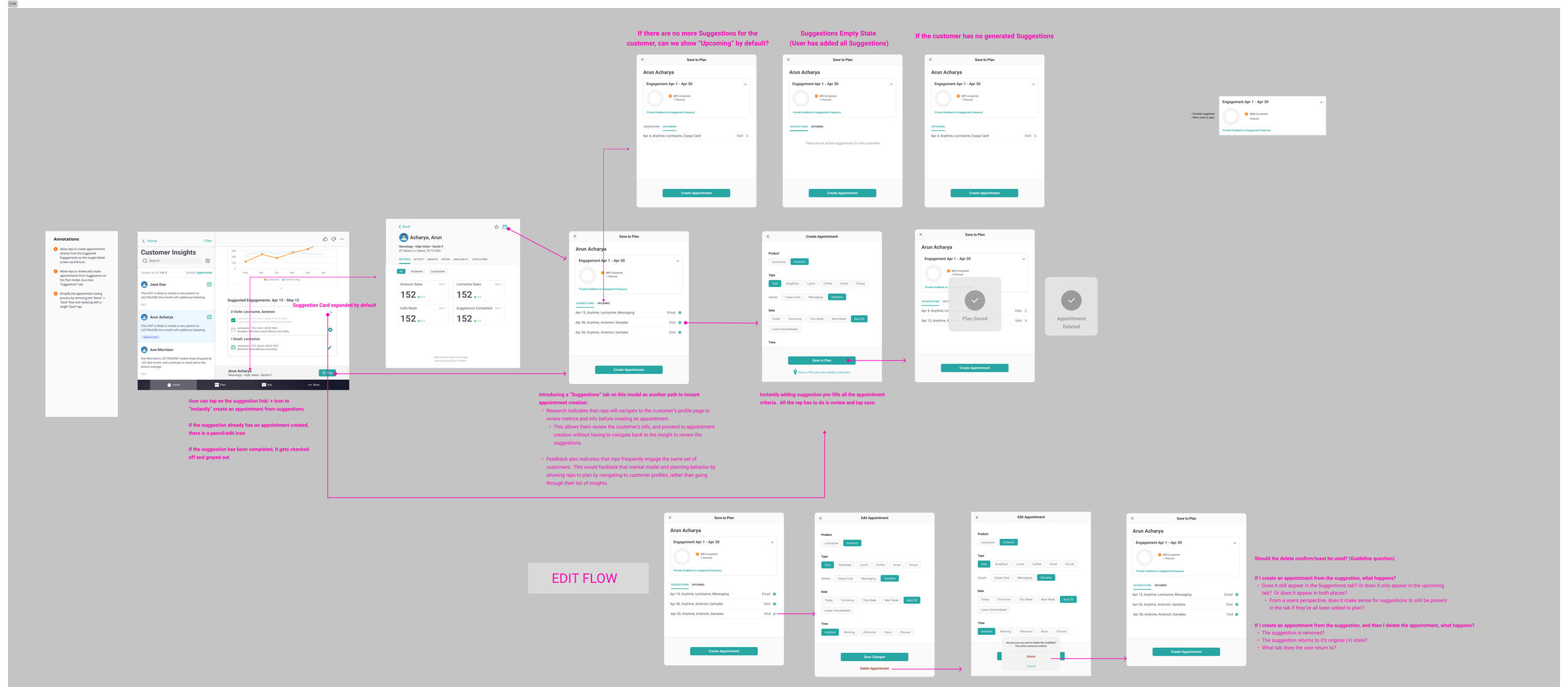
Task Flow
I went with a card component to make the information discoverable and anchor some of the icon elements we added.
Each suggestion is formatted as it’s own block to facilitate scannability.
A corresponding calendar icon to indicate status (Planned or Unplanned), and an action icon (Create or Edit).
Tapping the + icon will pre-populate the scheduler with the relevant Suggestion details, streamlining the appointment creation process.
The suggestions are fairly prominent on the UI as the main value prop.
We made sure the tone of the suggestion did not come off as imperative or over confident.

Outcomes
“I looked at a suggestion, I went into the office, and I used the messaging.
I would have never used that message because I thought I knew the doctor, I knew the office.
I used the suggestion and I could see their eyes light up and listen.
A change of language made a huge difference. You start to see those little things and then you realize there's value.”
- UCB Sales Rep Team Lead
“Suggestions are awesome. Easy to see what I need. I want to come here before I go into an office… so that I have a game plan when I walk into that office.”
- UCB Sales Rep
In later user interviews, feedback around our design was positive.
10 out of 10 users were very satisfied and categorized it as an experience improvement and valuable tool.
9 out of 10 users felt more prepared with Suggestions.
8 out of 10 users indicated it would help them act on more suggestions.
8 out of 10 users thought it would help them improve their sales.
The suggestions also became the centerpiece of our client demos, with our consultants citing it as a strong hook for prospective clients.
We hope that the intelligence behind the Suggestions continues to improve, and the granularity and sophistication of the outputs follow suit.
With that brings more opportunities to improve the design and experience of FI:
Users were interested in even more transparency and understanding the triggers behind the algorithm.
Users were interested in sharing Suggestions with other team members, creating more collaboration, sharing targets, and increasing their territory outreach.
Internally, we see opportunities to empower our own algorithms and inform users with a transparent scoring system.
Can we assign a score to each suggestion? Can we update the score based on any modification the user makes?We also see opportunity to integrate with other user tools such as calendar apps and RxVantage (HCP schedule viewer).
On a personal level, I felt this design delivery was a good example of the product team sticking to the core product vision and personality. We knew we had something valuable with Suggestions, and even though they were initially lacking, we continued improving them until they reached maturity.
There’s always the risk of being too “big brother” with sales and business intelligence tools, but we managed to promote adoption and develop the feature following an evidence driven process.